![]()
Subscribe To Our Blog
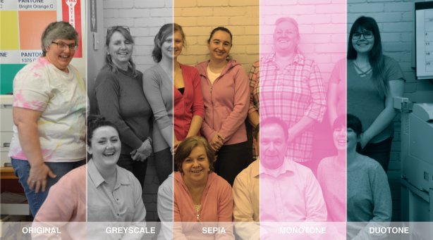
Photo Filters: They’re not just for Instagram
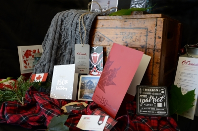
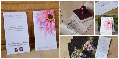
Photos speak a thousand words, which is why it’s important to carefully choose your photos when using them in print. The images you select should support your content without being distracting or seeming out-of-place.
For example, if you’re creating a theatre program for a play set in World War 1 you may want to edit your new, digital photos to look like they were taken in the early 1900s by using greyscale or sepia tone filters.
What are photo effects?
Photo effects are filters that we apply to an image in Photoshop to visually alter the colouring and style of the photo. You’re probably familiar with filters in Instagram like “Moon” to change your photo to black and white, or “Juno” to bump up the colour vibrancy. The best part about digital photo effects is that you’ll always have a copy of the original, unaltered photo. You can also try on different effects until you find one that suits the application.
What photo effects can be used?
A few of the most common effects are:
1. Greyscale – a black and white image
2. Sepia – a black and white image with warm tones
3. Monotone – similar to a black and white image with a colour replacing the black areas in the photo
4. Duotone – A pair of light and dark colours replace what would typically be the black and white areas in an image
We can also edit images by sharpening slightly, lightening, darkening or by increasing colour vibrancy, saturation and contrast.
Why use photo effects?
1. Create consistency in your images – Photos taken at a different time, place, or with a different camera have variations that make it obvious they aren’t a matching set.
For example, if you want to have canvases printed for your home using a variety of old and new family photos, we could make them match by making them black and white.
2. Save money – Printing your publication in greyscale, 1 colour (monotone) or 2 colour (duotone) can sometimes reduce costs because we use less ink colours. Although full colour CMYK printing is vibrant and swanky, 2 ink colours can be just an impactful when used in a good design with a thoughtfully selected paper stock.
3. Give your publication a different vibe – Take your photos back to Victorian times with sepia tones or bump up the colours to make your print extra fun and bold.
4. Stay on brand – By using your brand colours as the image colours you can keep everything that you print cohesive.